

Wyoming students in the College of Agriculture and Natural Resources are using satellite images from the U.S. Geological Survey (USGS) to gauge and improve lands owned by their families.
Photographs are from years of satellite collection and offered free by the USGS, said Ramesh Sivanpillai, course instructor, and senior research scientist in the Wyoming Geographic Information Science Center.
“Landsat is the longest civil satellite data collection we have,” said Sivanpillai. “The USGS opening the archive has created opportunities for instructors like us to integrate students.”
Jacob Disney from Sundance and Tyler Jones from Rosette applied Landsat imagery to their family properties. The two completed the course last December. Jones was interested in finding problem spots on land his family had been haying. Disney observed the incremental changes to his family’s property over the last 10 years. Sivanpillai was able to download the images over the time span.
Jacob Disney Project Purpose
Tyler Jones Project Purpose
The USGS says it provides the portal to the largest archive of remotely sensed land data in the world. Each pixel in the image represents a 100 by 100-foot area on the ground.
Students can obtain images of the land that, for example, are owned by their families. The students study an area they are familiar with, rather than working with images from anywhere around the world, such as deforestation of the Amazon or other examples in which students have no first-hand or on-the-ground knowledge of what is happening.
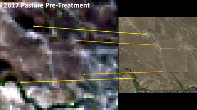 Landsat 8 true color image and Google Map image, with arrows showing common points for reference
“By giving them images from their parent’s or a relative’s property, they know exactly what was done on the ground,” said Sivanpillai. “They can see how that is reflected in the images, and they can link it to what I am teaching in my lectures.”
The remote sensing class is offered each fall, and over the years Sivanpillai has had students from 19 states, with most in the Wyoming, Montana, Colorado, Idaho, and California area. Maryland is the eastern-most state.
Vegetation appears red in the false color images because of its higher reflection in the infrared region (above and far left). Pixels in the processed image (right side of left image) have been grouped based on the amount of reflected light in the infrared and visible region. Move the white arrows located in the center of the images left and right to view more of an individual image.
“This is what this free data allows us to do,” said Sivanpillai. “You don’t have to pay for the data set, and as long as the student is able to tell me where the field is and they are consulting with their family members of supervisors to tell what crops are growing, planting dates, harvest dates, we can download as many images as we want as long as there are no clouds over the area of interest.”
Sivanpillai always tells his students at the end of a semester he’s the one who has learned the most.
“They teach me how the land was managed in that part of the state (being studied), how they harvest and explain strange patterns they find and why that is. All of that is possible because the USGS opened up the archive and revolutionized the way we are teaching remote sensing.”
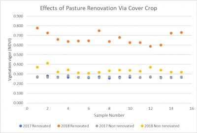 Vegetation vigor in renovated pasture increased from 2017 (blue dots) to 2018 (orange dots). However, no increase was seen in the non-renovated areas between 2017 (gray dots) and 2018 (yellow dots).